

Prototyping an Inventory Screen - Part 2: UI Components & Interactivity
In Part 2 of this walkthrough, we will transform our layout skeleton into a rich, interactive visual prototype using Gameface UI’s built-in basic components.
- First, we will populate the center grid options using the
<Dropdown>and<Checkbox>components. - Next, we will fully build out the right-side Item Inspector using inputs, progress bars, and buttons.
- Finally, we will polish the prototype by adding active visual states to our navigation links.
Integrating Complex UI Components
Section titled “Integrating Complex UI Components”Before we write any code, let’s talk about how Gameface UI components are structured. They use a compound component pattern, meaning complex elements are broken down into their individual parts.
Instead of passing a massive list of props to a single monolithic tag (e.g., <Dropdown color="red" label="Sort" />),
we compose the UI using smaller, targeted sub-components like <Dropdown.Trigger> and <Dropdown.Placeholder>.
This philosophy gives you granular control over the layout and styling of every individual piece without fighting the boilerplate.
Populating the Grid Options
Section titled “Populating the Grid Options”In Part 1, we left an empty <Flex> container with the class grid-options above our inventory grid.
Our goal here is to add interactive controls so the player can sort their items and filter for usable gear.
Open Inventory.tsx and import the required components at the top of your file:
import Dropdown from "@components/Basic/Dropdown/Dropdown";import Checkbox from "@components/Basic/Checkbox/Checkbox";Now, let’s populate the .grid-options container.
{/* Grid Wrapper */}<Flex direction="column" class={styles['grid-wrapper']}>
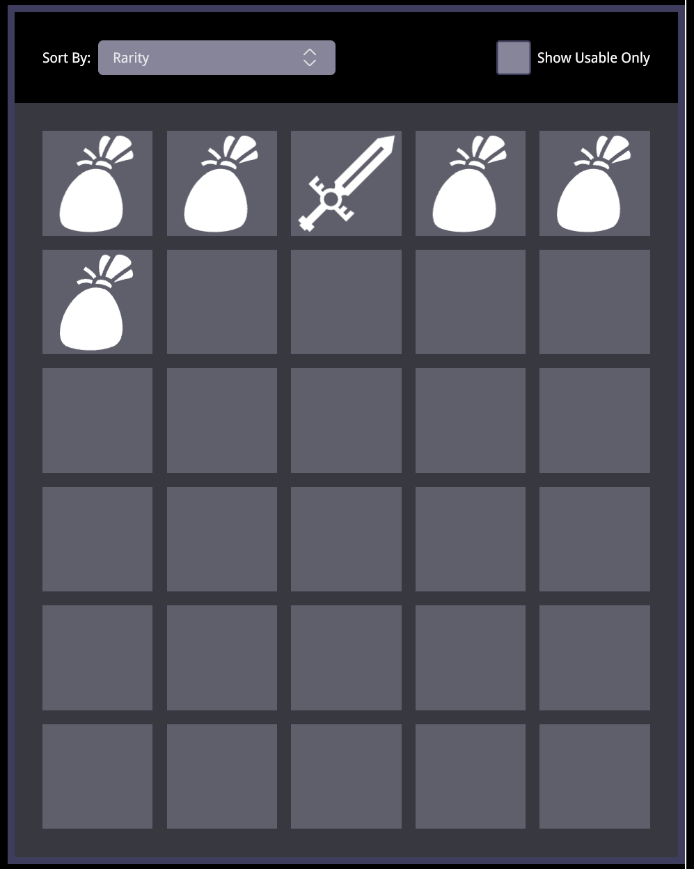
{/* Empty header for interactive options */} <Flex class={styles['grid-options']} justify-content="space-between" align-items='center'></Flex> {/* Grid Sorting & Filtering Options */} <Flex class={styles['grid-options']} justify-content="space-between" align-items='center'>
<Flex direction="row" gap="0.5rem" align-items="center"> <div>Sort By:</div> <Dropdown> {/* We can inject custom classes directly onto the sub-components */} <Dropdown.Trigger class={styles['grid-options-dropdown-trigger']} /> <Dropdown.Placeholder style={{color: 'white'}}>Rarity</Dropdown.Placeholder> <Dropdown.Icon class={styles['grid-options-dropdown-icon']} /> </Dropdown> </Flex>
<Checkbox> <Checkbox.Control class={styles['grid-options-checkbox']} /> {/* Using the built-in label simplifies formatting */} <Checkbox.Label>Show Usable Only</Checkbox.Label> </Checkbox>
</Flex>
{/* The 5x6 Inventory Grid */} <Grid cols={5} rows={6} gap='1rem' class={`${styles.grid}`} column-class={styles['grid-cell']}> {/* ... Grid Tiles ... */} </Grid>
</Flex>To make these components match the aesthetic of our prototype, apply our custom dimensions and colors. Open Inventory.module.scss
and nest the following targeted styles inside your existing .grid-options class:
.grid {    // ... existing grid styles ...
    &-options {        padding: 2rem;        width: 100%;
        // Targeting the specific Dropdown sub-components we declared        &-dropdown-trigger {            width: 17rem;            height: 2.5rem;            background-color: $primaryColor;        }
        // Targeting the default svg in the dropdown icon        &-dropdown-icon path {            stroke: $disabledTextColor;            transition: stroke .15s ease;        }
        // Targeting the Checkbox control box        &-checkbox {            width: 2.5rem;            height: 2.5rem;        }    }}
Results
Section titled “Results”With these changes your inventory grid should be looking like this:
Building the Item Inspector
Section titled “Building the Item Inspector”Now we will transform the right column (<Column.Four>) from a simple placeholder into a fully fleshed-out item details panel.
This is where a component library really shines. Instead of spending hours writing custom logic for sliders, input fields, and toggle states, we can use Gameface UI’s pre-built interactive components to rapidly assemble our prototype.
First, import the necessary UI and layout components at the top of Inventory.tsx:
import Progress from "@components/Feedback/Progress/Progress";import NumberInput from "@components/Basic/Input/NumberInput/NumberInput";import Button from "@components/Basic/Button/Button";import ToggleButton from "@components/Basic/ToggleButton/ToggleButton";import Relative from "@components/Layout/Relative/Relative";import Absolute from "@components/Layout/Absolute/Absolute";We will cover this column in three distinct parts: the item identity, the item stats, and the interactive controls.
Part 1: Item Identity and Wrapper
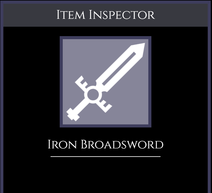
Section titled “Part 1: Item Identity and Wrapper”Our first goal is to set up the main <Flex> wrapper for the panel, add the inspector header, and display the item’s image and name.
Replace the placeholder inside your <Column.Four> with this new structure:
<Column.Four class={styles['item-container']}>    <Flex class={styles['item-wrapper']} direction="column" align-items="center" gap={'1.5rem'}>
        {/* Header & Item Icon */}        <h2 class={styles['item-inspector-label']}>Item Inspector</h2>        <div class={styles['item-image']}>            <Icon.inventory.sword fill />        </div>
        {/* Item Name */}        <Flex direction="column" align-items="center" gap="0.5rem">            <h3 class={styles['item-name']}>Iron Broadsword</h3>            <div class={styles.separator}></div>        </Flex>
        {/* We will add stats and controls here next */}
    </Flex></Column.Four>
Next, open Inventory.module.scss and add the specific classes required to style this upper section. We use our predefined $font-cinzel variable to give the headers that classic RPG aesthetic.
.item {    &-container {        padding: $global-spacing;    }
    &-wrapper {        border: 0.5rem solid $secondaryColor;        flex-grow: 1;        font-size: 1.375rem;    }
    &-inspector-label {        width: 100%;        padding: 0.5rem;        margin: 0;        background-color: $background-soft-solid;        text-align: center;        font-family: $font-cinzel;    }
    &-image {        width: 15rem;        height: 15rem;        background-color: $primaryColor;        border: 0.5rem solid $secondaryColor;    }
    &-name {        font-family: $font-cinzel;        color: white;        font-size: 2rem;    }}
.separator {    width: 18rem;    height: 0.1rem;    background-color: white;}
Result
Section titled “Result”So far your item inspector panel should be looking like this:
Part 2: Stats and Durability
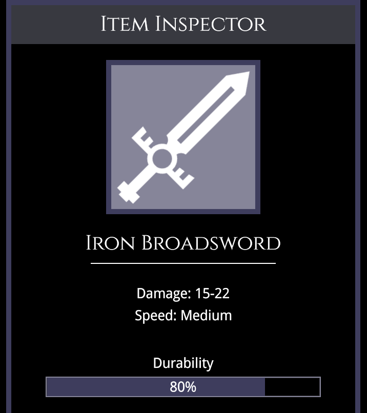
Section titled “Part 2: Stats and Durability”Our next goal is to display the weapon’s stats and its current durability.
A common challenge in UI design is overlaying text onto a progress bar. Instead of polluting your CSS files with arbitrary class names and wrapper elements just to handle basic positioning,
Gameface UI makes this structural relationship explicit with the help of the <Relative> and <Absolute> layout components.
Add this code inside your .item-wrapper flex container, right below the item name separator:
{/* Basic Stats */}<Flex direction="column" align-items="center" gap="0.5rem" >    <div>Damage: 15-22</div>    <div>Speed: Medium</div></Flex>
{/* Durability Bar with Absolute Text Overlay */}<Flex direction="column" align-items="center" gap="0.5rem" style={{width: '80%', margin: "1rem 0"}}> <div>Durability</div> <Relative style={{width: '100%', height: '2rem'}}> <Progress.Bar progress={80} style={{width: '100%', height: '100%'}} /> <Absolute center>80%</Absolute> </Relative></Flex>Result
Section titled “Result”After these changes the item inspector panel should be looking like this:
Part 3: Interactive Controls
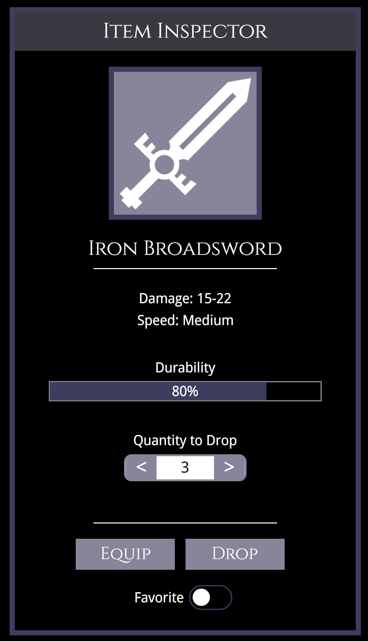
Section titled “Part 3: Interactive Controls”Finally, we need to add the final piece of components.
Here we see the compound component pattern shine again with the <NumberInput>. Because it is split into DecreaseControl, IncreaseControl, and Input pieces,
we can easily inject inline styles (like fontSize: '2rem') on the exact element we need them.
We also drop in the standard <Button> and <ToggleButton> components to round out “Item inspector” panel.
Add this final block of code directly below the Durability section:
{/* Compound Number Input */}<Flex direction="column" align-items="center" gap="0.5rem">    <div>Quantity to Drop</div>    <NumberInput value={1} style={{width: '12rem'}}>        <NumberInput.DecreaseControl position="before" style={{width: '3rem', height: '3rem', fontSize: '2rem'}}>{'<'}</NumberInput.DecreaseControl>        <NumberInput.IncreaseControl style={{width: '3rem', height: '3rem', fontSize: '2rem'}}>{'>'}</NumberInput.IncreaseControl>        <NumberInput.Input style={{textAlign: 'center', fontSize: '1.5rem' }} />    </NumberInput></Flex>
<div class={styles.separator} style={{marginTop: '2rem'}}></div>
{/* Action Buttons */}<Flex gap="1rem">    <Button class={styles['item-button']}>Equip</Button>    <Button class={styles['item-button']}>Drop</Button></Flex>
{/* Toggle Button */}<ToggleButton>    <ToggleButton.LabelLeft>        <div style={{marginRight: '0.5rem'}}>Favorite</div>    </ToggleButton.LabelLeft></ToggleButton>
To finish off the inspector, add this single rule to your Inventory.module.scss to style the buttons:
.item {    // ... previous item styles ...
    &-button {        font-family: $font-cinzel;        color: white;        font-size: 2rem;    }}
Results
Section titled “Results”With that the final column of our prototype has been finished! The final result:
Adding Visual Feedback to Elements
Section titled “Adding Visual Feedback to Elements”A prototype isn’t complete until it feels interactive. We need to add visual cues so the player knows which navigation tab they are currently viewing, as well as which inventory items are currently selected.
The Navigation Arrow
Section titled “The Navigation Arrow”In Part 1, we passed activeClass={styles['tab-link-current']} to our Inventory <TabLink>. The Gameface UI component automatically applies this class when the current route matches the link. Now, let’s actually write that CSS to give it a cool, active indicator arrow.
We will use an ::after pseudo-element and a CSS clip-path to draw the arrow dynamically. Open Inventory.module.scss and add this to your sidebar styles:
.tab-link {    // ... existing tab-link styles ...
    &-current {        background-color: $secondaryColor;        color: white;        position: relative;
        /* Adds the active indicator arrow pointing to the content */        &::after {            content: '';            position: absolute;            top: 0;            bottom: 0;            right: -3rem;            width: 3rem;            z-index: -1;            background-color: $secondaryColor;            clip-path: polygon(0 0, 0 100%, 100% 50%);        }    }}
The Inventory Slots (Using Mixins)
Section titled “The Inventory Slots (Using Mixins)”Next, we need to create an “active” state for our inventory slots so the player knows exactly which item they have selected.
Because the styles for the active states of both the equipped items and the grid items are almost identical, we can leverage SCSS @mixin .
Think of a mixin as a reusable function for your CSS. Instead of copying and pasting the same block of styles across different classes, you define the rules once in a mixin and @include
them wherever needed. You can even pass arguments to them to handle minor variations!
Add this mixin at the top of your Inventory.module.scss file, right below your variables.
// Define the mixin to handle active slot borders and backgrounds@mixin active-slot($border-width) { border: $border-width solid white; background-color: $secondaryColor;}We will pass $border-width as an argument so we can slightly adjust the thickness depending on where the item is located.
Now, scroll down and use the @include directive to apply this mixin to our equipped items and grid tiles:
.equipped {    // ... existing equipped styles ...
    &-item {        width: 6.15rem;        height: 6.15rem;        background-color: $primaryColor;
        // Apply the mixin with a 0.20rem border        &-active {            @include active-slot(0.20rem);        }    }}
.grid {    // ... existing grid styles ...
    &-cell {        background-color: rgba($primaryColor, 0.5);    }
    // Apply the mixin with a slightly thicker 0.25rem border    &-item-active {        @include active-slot(0.25rem);    }}
Simulating the Active State
Section titled “Simulating the Active State”Finally, let’s hardcode these active classes onto a couple of items in Inventory.tsx so we can see the visual feedback in our prototype.
Let’s make the sword and boots slots in the equipped items panel and the sword item in the grid look “selected.”
{/*  Equipped Items */}<Flex direction="column" align-items="center" justify-content="space-between" gap="1.375rem" class={styles['equipped-items-wrapper']} >    <div class={styles['equipped-item']}><Icon.inventory.helmet fill /></div>    <div class={styles['equipped-item']}><Icon.inventory.breastPlate fill /></div>    <div class={styles['equipped-item']}><Icon.inventory.pants fill /></div>    {/* Apply the active class to the sword & boots */}    <div class={`${styles['equipped-item']} ${styles['equipped-item-active']}`}><Icon.inventory.boots fill /></div>    <div class={`${styles['equipped-item']} ${styles['equipped-item-active']}`}><Icon.inventory.sword fill /></div>    <div class={styles['equipped-item']}><Icon.inventory.shield fill /></div></Flex>
// ... further down ...
{/* Inside the Grid */}<Grid.Tile row={1} col={1}><Icon.inventory.bag fill /></Grid.Tile><Grid.Tile row={1} col={2}><Icon.inventory.bag fill /></Grid.Tile>{/* Apply the active class to the sword in the grid */}<Grid.Tile row={1} col={3} class={styles['grid-item-active']}><Icon.inventory.sword fill /></Grid.Tile><Grid.Tile row={1} col={4}><Icon.inventory.bag fill /></Grid.Tile>
Final Result
Section titled “Final Result”With these final touches our prototype is now finished!
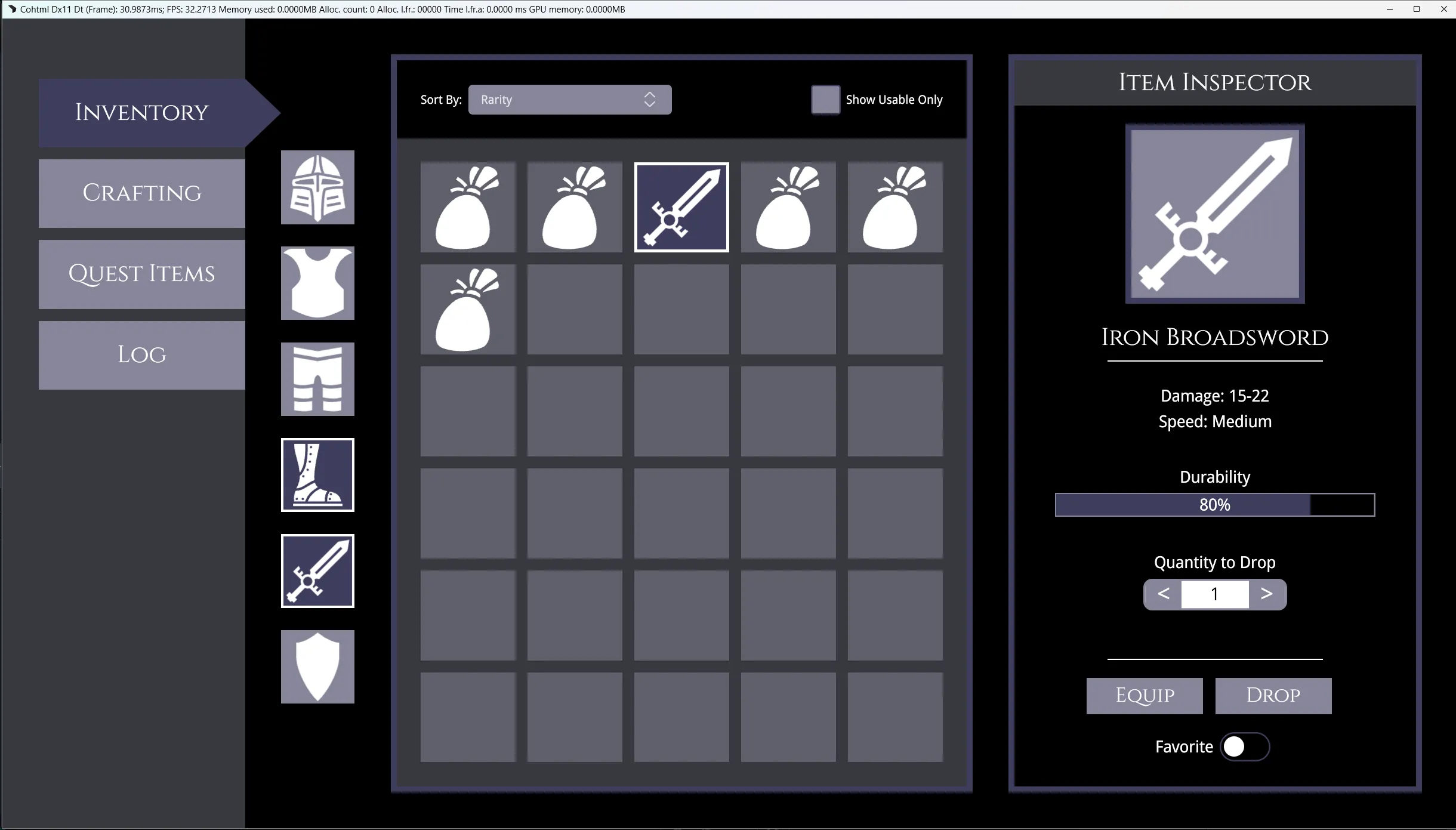
Wrapping Up
Section titled “Wrapping Up”Congratulations! You have successfully built a rich, visual prototype from the ground up.
Throughout this two-part series, you’ve learned how to:
- Wire up layouts using structural components like
<Row>,<Column>, and<Grid>. - Compose interactive UI using Gameface UI’s compound components like
<Dropdown>and<NumberInput>. - Position elements using spatial components like
<Flex>,<Relative>and<Absolute center>. - Polish visual feedback using CSS Modules and SCSS
@mixins.
© 2026 Coherent Labs. All rights reserved.