

Spatial Navigation & Focus Management
Wire arrow keys and a gamepad D-Pad to drive HTML :focus using the Interaction Manager’s spatialNavigation module. This article covers setup, areas, programmatic control, custom direction keys, and the focus styling that gamepad players rely on to see what is selected.
HTML focus moves naturally with the Tab key, but a game UI is driven by arrow keys or a D-Pad pressed in any of four directions. Gameface does not
map those inputs to focus on its own. Building it manually means tracking the focused element, computing which focusable element sits closest in a
given direction, calling .focus() on it, and repeating that work on every direction press.
The spatialNavigation module in coherent-gameface-interaction-manager is that loop, already written. Register the elements
you want to be navigable and IM handles the rest. If you have not set up the Interaction Manager yet, the
Keyboard & Gamepad Input article covers installation and the other available modules.
How spatial navigation works
Section titled “How spatial navigation works”Spatial navigation does not create a new focus abstraction. It moves the standard DOM :focus from one element to another based on geometry. When a
direction is pressed, IM measures the bounding rectangles of the registered elements relative to the currently focused element and calls .focus()
on the closest valid target in that direction.
Registering navigable elements
Section titled “Registering navigable elements”Basic setup
Section titled “Basic setup”The minimum useful setup is one call. Tell IM which elements should be navigable. Selector strings ,
direct HTMLElement references , or a mix of both are all valid.
import { spatialNavigation } from "coherent-gameface-interaction-manager";
spatialNavigation.init([".menu-item"]);
Once init runs, pressing arrow keys or directional input on a connected gamepad moves focus between the matching elements. The default key bindings
are the four arrow keys. The default gamepad direction is the D-Pad.
Adding elements that appear later, like rows of an infinitely scrolling list, uses add() with the same input shapes:
spatialNavigation.add([".new-row"]);Tearing it all down on screen unmount uses deinit():
spatialNavigation.deinit();Skipping an element without removing it from the DOM is also supported. IM honors a disabled attribute and walks past those elements when
calculating the next focus target.
<button class="menu-item">Resume</button><button class="menu-item" disabled>Multiplayer</button><button class="menu-item">Settings</button>Grouping elements with areas
Section titled “Grouping elements with areas”A flat list works until two regions of the UI start competing for the same directional input. Consider a loot screen with a left loot panel, a right inventory panel, and a filter row nested inside the inventory. Pressing “right” from the loot panel should not wrap straight into the inventory items below the filter, and the filter should be reachable independently without the loot panel’s focus interfering.
Named areas solve this. Each part of the UI is split into a different area, and the player can switch between them. Directional input only moves focus within the active area.
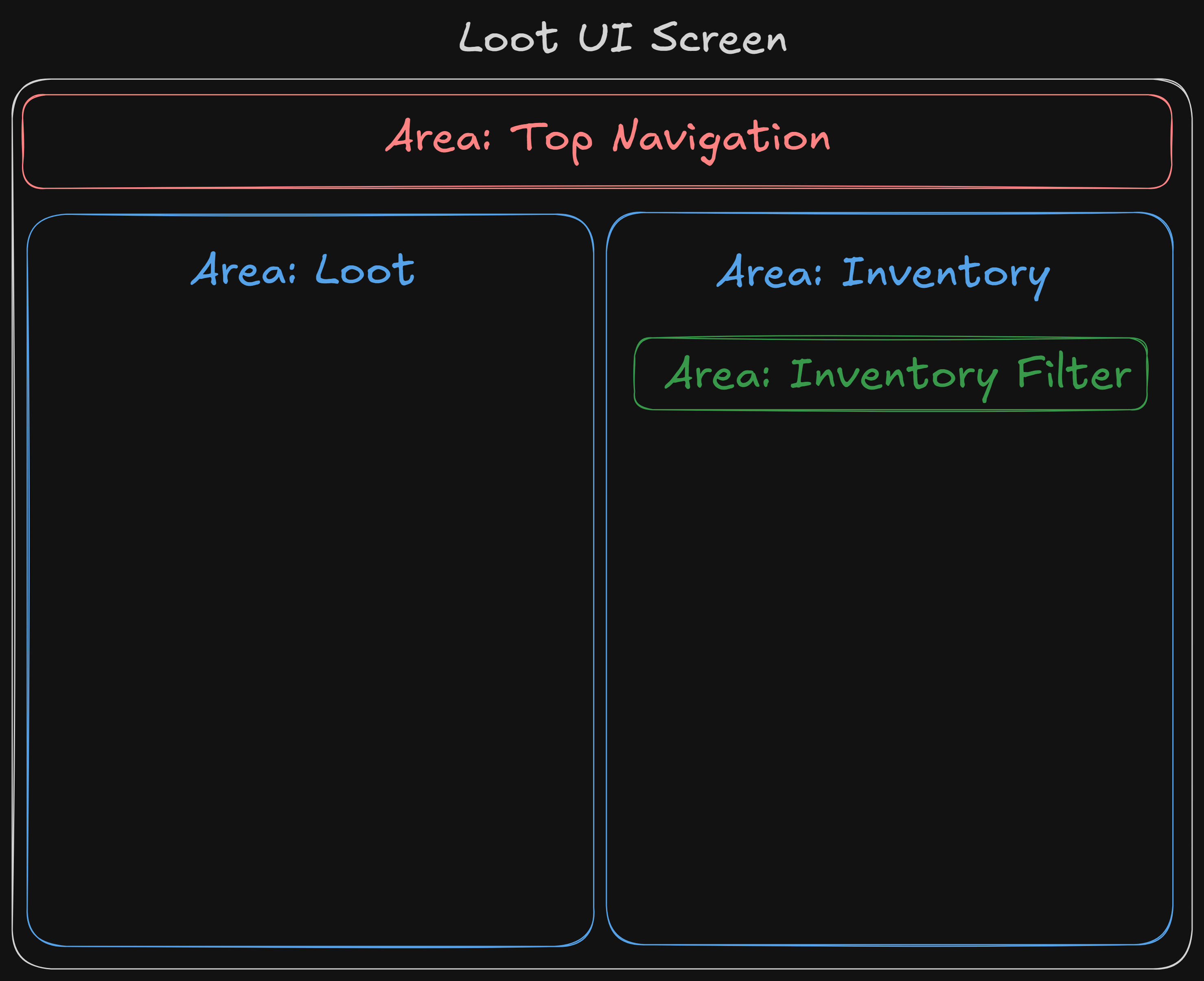
Each area is a separately tracked group of elements. Navigation stays within the active area until you switch to another one. Registering the loot screen from the diagram looks like this:
spatialNavigation.init([ { area: "top-nav", elements: [".top-nav-item"] }, { area: "loot", elements: [".loot-item"] }, { area: "inventory", elements: [".inventory-item"] }, { area: "inventory-filter", elements: [".filter-chip"] },]);Elements passed as a flat array land in the implicit 'default' area. Mixing both forms is fine, and areas can also be added after the initial call
using add():
spatialNavigation.init([".header-button"]); // lives in 'default'spatialNavigation.add([ { area: "modal", elements: [".modal-button"] }, // named area added later]);When an area’s elements come off the screen, for example when a panel unmounts, clear them with remove(area). Without arguments it clears the
default area.
spatialNavigation.remove("modal");Controlling navigation
Section titled “Controlling navigation”Switching between areas
Section titled “Switching between areas”switchArea(area) moves focus into the given area. It attempts to restore the element that was focused there last, falling back to the first element when nothing has been focused in that area yet, or when the previous element has been removed or disabled.
spatialNavigation.switchArea("modal");That behavior is usually what you want. A player who navigates out of the inventory and back in expects to land where they left off. When you need a
guaranteed entry point, call focusFirst (or focusLast) directly instead.
spatialNavigation.focusFirst("modal");spatialNavigation.focusLast("modal");To inspect state without moving focus, the module exposes getLastFocused(area) and a lastFocusedElement property on the module itself:
const previously = spatialNavigation.getLastFocused("loot");To drop focus entirely, for example when every panel closes and the game grabs back control, call clearFocus():
spatialNavigation.clearFocus();Pausing and resuming navigation
Section titled “Pausing and resuming navigation”pause() stops IM from consuming direction keys. resume() turns it back on. The less obvious case where this matters is a key-binding menu. The player clicks “Rebind Jump”, and the next physical key press should be captured as the new binding. If spatial navigation is still listening, pressing an arrow key inside that listener also moves focus to a different row, and the rebind lands on the wrong control.
function startRebind(action: string) {    spatialNavigation.pause(); // stop IM from eating the next arrow key
    const handler = (event: KeyboardEvent) => {        bindings[action] = event.code;        window.removeEventListener("keydown", handler);        spatialNavigation.resume(); // hand input back to navigation    };
window.addEventListener("keydown", handler);}Customizing direction keys
Section titled “Customizing direction keys”The default direction bindings are the four arrow keys. Add to them or replace them with changeKeys .
spatialNavigation.changeKeys( { up: "W", down: "S", left: "A", right: "D" }, { clearCurrentActiveKeys: true },);The clearCurrentActiveKeys option controls whether the new keys are added to the existing ones or replace them. The default is false, which lets
WASD coexist with the arrow keys, useful when a game supports both layouts. Setting it to true swaps the binding entirely .
To revert at any point:
spatialNavigation.resetKeys();Tuning the overlap parameter
Section titled “Tuning the overlap parameter”init() accepts an optional second argument, overlap , between 0.01 and 1. It controls how much overlap a candidate element
must share with the current focus along the perpendicular axis to be considered in line. The default is 0.5.
A case where you might need to tune it is an irregularly shaped grid where cells span different heights, leaving some items vertically offset from
their neighbors. Pressing “right” can skip an offset cell because its perpendicular overlap with the current focus falls under the default threshold.
Raising overlap to a less strict value brings those cells back into range.
spatialNavigation.init([".grid-cell"], 0.55);Styling the focused element
Section titled “Styling the focused element”Spatial navigation only does half the job. It moves focus to the right element. The player still needs to see which element that is.
A mouse user has a cursor to track. A gamepad user has nothing. If the focused element looks the same as every other element on the screen, the UI is effectively broken even though the input layer is working perfectly. Treat focus styling as a feature, not a polish item.
Writing focus styles
Section titled “Writing focus styles”Think of :focus as the navigational counterpart to :hover. Just as any interactive element should have a visible :hover state for mouse users,
any navigatable element needs an equally clear :focus state for gamepad and keyboard users. Without it, a player navigating with a D-Pad has no
indication of what is currently selected.
For example, a simple menu with a clear focus state on the buttons could look like this:
import Navigation from '@components/Utility/Navigation/Navigation';import Button from '@components/Basic/Button/Button';
const Menu = () => ( <Navigation scope="main-menu"> <Navigation.Area name="main-menu" selector=".menu-item" focused> <Button class="menu-item">Resume</Button> <Button class="menu-item">Settings</Button> <Button class="menu-item">Quit</Button> </Navigation.Area> </Navigation>);<div class="menu"> <button class="menu-item">Resume</button> <button class="menu-item">Settings</button> <button class="menu-item">Quit</button></div>The CSS adds a high-contrast border and a background lift to the focused button:
.menu-item {    background: #1a1f2e;    color: #e6e8eb;    padding: 12px 24px;    border: 2px solid transparent;    border-radius: 6px;    transition:        border-color 80ms ease-out,        background 80ms ease-out;}
.menu-item:focus {    border-color: #ffb24a; /* high-contrast accent, readable at distance */    background: #2a3142;   /* lift the element so it stands out from its siblings */}
Sequential Tab navigation with the polyfill
Section titled “Sequential Tab navigation with the polyfill”Most game UIs do not need the Tab key. Spatial navigation covers the input model gamepad players actually use. The exception is a form-like or
settings-like screen where designers want explicit Tab and Shift+Tab traversal, the way a standard form works. Gameface does not produce that
sequential order natively. A polyfill ships with the Gameface package to add it.
The script is located at package\Samples\uiresources\polyfills\Tabindex\coherent-tabindex-polyfill.js. Include it alongside the page, then mark elements
with tabindex to set their order.
import TextInput from '@components/Basic/TextInput/TextInput';import Button from '@components/Basic/Button/Button';
// Load polyfill in main.tsx or index.html <head>const SettingsForm = () => ( <> <TextInput class="field" attr:tabindex="1" /> <TextInput class="field" attr:tabindex="2" /> <Button attr:tabindex="3">Save</Button> </>);<script src="coherent-tabindex-polyfill.js"></script>
<input class="field" tabindex="1" /><input class="field" tabindex="2" /><button tabindex="3">Save</button>Default focusable elements (input, textarea, button, a) get a baseline tabindex="0". Negative values opt an element out of the sequence
entirely. Elements with a set overflow value receive an automatic tabindex="0" on polyfill initialization, unless one is already specified.
The Gameface UI Navigation component
Section titled “The Gameface UI Navigation component”Teams already using Gameface UI components have a higher-level option. The Navigation component wraps spatialNavigation and
exposes a declarative area model, a useNavigation() hook for programmatic control from inside the tree, and a counter-based pause and resume that
survives multiple callers asking for the same thing.
<Navigation scope="main-menu"> <Navigation.Area name="main-menu" selector="button" focused> <button>Start</button> <button>Settings</button> <button>Quit</button> </Navigation.Area></Navigation>The component still drives the same underlying IM module, so the geometry, the :focus model, and the styling rules above all apply. Pick this layer
when the rest of your UI is already built on Gameface UI components. For the full API, see the
Navigation component documentation.
Wiring it together: a modal focus trap
Section titled “Wiring it together: a modal focus trap”The walkthrough below builds a pause menu where opening a confirmation modal traps navigation inside it, and closing the modal restores the main menu’s last-focused button.
-
Mark up the two regions
Section titled “Mark up the two regions”The pause menu and the modal each get their own root container with focusable children. The modal starts hidden via a CSS class.
PauseMenu.tsx import { createSignal } from 'solid-js';import Navigation from '@components/Utility/Navigation/Navigation';import Button from '@components/Basic/Button/Button';import Modal from '@components/Feedback/Modal/Modal';import TextBlock from '@components/Basic/TextBlock/TextBlock';const PauseMenu = () => {const [modalOpen, setModalOpen] = createSignal(false);return (<Navigation scope="app"><Navigation.Area name="app" selector=".app-button" focused><Button class="app-button">Resume</Button><Button class="app-button">Save</Button><Button class="app-button" onClick={() => setModalOpen(true)}>Quit</Button></Navigation.Area><Modal open={modalOpen()} onClose={() => setModalOpen(false)}><Modal.Overlay closeOnClick /><Modal.Window><Navigation scope="modal"><Navigation.Area name="modal" selector=".modal-button" focused><TextBlock>Quit to title screen?</TextBlock><Button class="modal-button" onClick={() => { /* quit logic */ }}>Quit</Button><Button class="modal-button" onClick={() => setModalOpen(false)}>Cancel</Button></Navigation.Area></Navigation></Modal.Window></Modal></Navigation>);};pause.html <div class="app"><button class="app-button">Resume</button><button class="app-button">Save</button><button class="app-button" id="open-quit">Quit</button></div><div class="modal modal--hidden" id="quit-modal"><p>Quit to title screen?</p><button class="modal-button" id="confirm-quit">Quit</button><button class="modal-button" id="cancel-quit">Cancel</button></div>pause.css .modal--hidden {display: none;} -
Register both areas up front
Section titled “Register both areas up front”Both regions are registered as named areas the moment the screen mounts. IM does not require an area to be visible, it just will not move focus into elements it cannot resolve, which becomes useful in the next step.
src/input/pause-nav.ts import { spatialNavigation } from "coherent-gameface-interaction-manager";spatialNavigation.init([{ area: "app", elements: [".app-button"] },{ area: "modal", elements: [".modal-button"] },]);spatialNavigation.focusFirst("app"); -
Open the modal and switch areas
Section titled “Open the modal and switch areas”When the player triggers the modal, show it and call
switchArea("modal"). From this point IM resolves direction presses only to elements inside the modal. The trap is automatic, no extra “lock” call is required.function openQuitModal() {const modal = document.getElementById("quit-modal");modal.classList.remove("modal--hidden");spatialNavigation.switchArea("modal");}document.getElementById("open-quit").addEventListener("click", openQuitModal); -
Close the modal and restore the previous focus
Section titled “Close the modal and restore the previous focus”switchArea("app")restores the element the player came from, because IM remembers the last focused button in the app area. No bookkeeping needed in user code.function closeQuitModal() {document.getElementById("quit-modal").classList.add("modal--hidden");spatialNavigation.switchArea("app");}document.getElementById("cancel-quit").addEventListener("click", closeQuitModal);
The same pattern scales to more involved interactions. In the menu below, activating a focused dropdown registers a new area for its options and switches to it. Picking an option unregisters that area and switches back to the parent menu, leaving focus on the dropdown the player came from.
© 2026 Coherent Labs. All rights reserved.