

Advanced UI Shapes: 9-Slice, Clipping, and Masking
Game UI panels often need to resize, cut into angled silhouettes, or blend into the scene without exporting a separate transparent image for every possible size.
This article covers three practical CSS techniques for that work: 9-slice scaling with border-image , hard geometric cuts with clip-path , and soft blending with mask-image .
Why Shape Techniques Matter in Game UI
Section titled “Why Shape Techniques Matter in Game UI”Many game UI screens are built from panels that cannot stay at one fixed size. A tooltip grows with item stats, a dialogue box expands for localized text, a quest card changes height depending on objectives, and HUD elements may need different proportions on ultrawide or compact layouts.
The direct asset approach is to export a separate PNG for every panel size and every shape variation. That is simple at first, but it creates three problems:
- The asset list grows quickly as the UI gains more states and sizes.
- Designers must re-export artwork for small layout changes.
- The UI can spend memory on large transparent areas that exist only to preserve a shape.
The better approach is to separate the visual rule from the final size of the element. 9-slice scaling keeps decorative corners
intact while edges stretch. clip-path cuts a rectangular element into a hard geometric shape. mask-image uses a stencil image or gradient to
reveal, hide, or fade parts of an element with soft edges.
They give you more control over how a small number of authored assets adapt to real UI layouts.
9-Slice Scaling with border-image
Section titled “9-Slice Scaling with border-image”9-slice scaling is used when a frame has important corners but flexible edges. Think of an item tooltip with ornate corners, a fantasy dialogue frame, or a sci-fi panel border. The corners should not stretch, because stretching them distorts the artwork. The top, bottom, left, and right edges can stretch because they are usually decorative strips.
This example is taken from the Player’s Playground example
In CSS, you implement 9-slice scaling with border-image . You point at one frame image and tell the renderer where to cut it, which turns the bitmap into a 3×3 grid. Each cell of that grid is painted onto the matching part of the element border:
- Four corners, which are preserved at their original aspect.
- Four edges, which stretch, repeat, or round to fill the available space.
- One center region, which can be left empty or filled depending on your needs.
Here is a minimal tooltip structure that uses a 9-slice frame:
import Block from '@components/Layout/Block/Block';import TextBlock from '@components/Basic/TextBlock/TextBlock';
const ItemTooltip = () => ( <Block class="item-tooltip"> <TextBlock class="item-tooltip__rarity">Legendary</TextBlock> <h2 class="item-tooltip__title">Voidheart Scepter</h2> <TextBlock class="item-tooltip__type">Two-Handed Staff, Arcane</TextBlock> </Block>);<div class="item-tooltip"> <div class="item-tooltip__rarity">Legendary</div> <h2 class="item-tooltip__title">Voidheart Scepter</h2> <p class="item-tooltip__type">Two-Handed Staff, Arcane</p></div>The tooltip frame should scale with the content inside it. The CSS below shows the complete border-image setup. This is what the Player’s Playground
example is demonstrating when you switch frame styles and adjust the slice value:
.item-tooltip {    width: 420px;    padding: 24px;    background: #0d0d1a;
    border: 24px solid transparent;    border-image-source: url("/assets/ui/fantasy-border.png");    border-image-slice: 500;    border-image-width: 24px;    border-image-repeat: stretch;}
Breaking Down the Properties
Section titled “Breaking Down the Properties”The rest of this section breaks down each property, explains what it controls, and covers the practical questions that come up when tuning a 9-slice frame for game UI.
border-image-source
Section titled “border-image-source”This property points to the frame artwork. It accepts a url() to a raster image (PNG, WebP) or an SVG. In most game UI workflows this is a single
authored frame asset exported by the art team.
border-image-source: url("/assets/ui/fantasy-border.png");border-image-slice
Section titled “border-image-slice”This is the property that makes the 9-slice work. It defines how far inward, from each edge of the source image, the renderer should cut before splitting the image into the nine regions. For raster images, the value is in source-image pixels (unitless). For SVG sources, you can use percentages.
/* Cut 500 source-image pixels from each side. */border-image-slice: 500;
/* Different insets per side: top, right, bottom, left. */border-image-slice: 64 48 64 48;
The slice value is not a design guess. It should match the way the frame image was authored. If the decorative corner occupies the outer 64 pixels of
the source image, the slice should be 64. If the corner detail extends 96 pixels, use 96. Getting this wrong either clips the corner art or
includes edge pixels in the corner region, producing visible seams.
The fill keyword
Section titled “The fill keyword”By default the center slice (the ninth region) is discarded and the element interior is controlled by background. Adding the fill keyword draws
the center slice into the element interior:
border-image-slice: 64 fill;This can be useful when the frame texture should continue seamlessly into the panel center. In most game UI workflows, however, the frame and the
panel background are authored separately, so you typically omit fill and let the background property handle the interior.
border-image-width
Section titled “border-image-width”This property controls how thick the rendered border-image appears on the element. It determines the area into which the nine slices are drawn on screen.
border-image-width: 24px;A common question is how border-image-width relates to the element’s own border width. They serve different roles:
- The element’s border (e.g.
border: 24px solid transparent) reserves layout space. It pushes padding and content inward, just like any CSS border. Without this, the content sits flush against the element edge and there is no room for the frame artwork to appear. - border-image-width tells the renderer how large the border-image drawing area should be. It can match the border width, but it does not have to.
When the two values match (both 24px in the example above), the image fills exactly the space the border reserved. If border-image-width is larger
than the element border, the image overflows inward and may overlap padding or content. If it is smaller, the image renders thinner than the reserved
border area and a gap becomes visible. For most 9-slice panels, keeping the two values equal is the safest starting point.
.tooltip--safe {    /* Both match: the image fills the layout space exactly. */    border: 24px solid transparent;    border-image-width: 24px;}
.tooltip--overflow { /* border-image-width is larger: the frame renders thicker than the reserved space. */ border: 16px solid transparent; border-image-width: 32px;}border-image-outset
Section titled “border-image-outset”border-image-outset pushes the rendered border image outward, beyond the element’s border box, without affecting layout. The element itself does not
grow and surrounding elements do not reflow.
border-image-outset: 8px;This is useful when a frame has a glow, dropshadow, or decorative flourish that should extend past the panel edge. Without outset, that detail would
be clipped at the border box. With an outset of 8px, the rendered frame extends 8 pixels outward on all sides, letting the outer detail remain
visible.
border-image-repeat
Section titled “border-image-repeat”This property controls how the four edge strips (top, right, bottom, left) are handled when they need to fill more space than the source slice provides. The three useful values are:
- stretch scales the edge strip to fill the available length. This is the most common choice for game UI frames because it produces a smooth result with any panel size.
- round tiles the edge strip, but rescales it so that a whole number of tiles fit without clipping. This works well when the edge art has a visible repeating pattern (chain links, rivets, runic symbols) and you want clean repetition without partial tiles.
- repeat tiles the edge strip at its natural size. If the available space is not an exact multiple of the tile, the last tile is clipped. This can produce visible cut-off artifacts at the panel edges, so it is rarely the right default for game UI.
.tooltip--stretched {    border-image-repeat: stretch;}
.tooltip--rounded {    /* Good for chain-link or rivet borders where the pattern should tile cleanly. */    border-image-repeat: round;}
.tooltip--tiled {    /* Tiles at natural size; may clip the last tile if the panel is not an exact multiple. */    border-image-repeat: repeat;}
For most 9-slice panels in game UI, stretch is the safe default. Switch to round when the art team has designed an edge strip with a visible
repeating motif and clean tiling matters more than uniform scaling.
The Shorthand
Section titled “The Shorthand”All five properties can be combined into a single border-image shorthand. The syntax packs source, slice, width, outset, and repeat into one
declaration:
/* source / slice / width / outset / repeat */border-image: url("/assets/ui/fantasy-border.png") 500 / 24px / 0 stretch;The shorthand is convenient once you are comfortable with the individual properties, but during development it is often easier to keep the longhand forms so each value is easy to find and adjust independently.
Caveats and Practical Guidelines
Section titled “Caveats and Practical Guidelines”9-slice with border-image is a good fit for rectangular panels that need decorative frames and dynamic content. It lets one frame asset support many
panel sizes without re-exporting. There are a few things to keep in mind when working with it:
- The shape is always a rectangle. The element border, and therefore the 9-slice frame, is fundamentally rectangular. If the final silhouette
needs angled corners, hexagons, or soft fades, combine the panel with
clip-pathormask-imageinstead of forcing the frame artwork to handle the shape. - Keep the panel background separate from the frame. Let
backgroundhandle the inner fill and letborder-imagehandle the edge artwork. This makes the frame reusable across tooltips, cards, and modal windows without coupling interior styling to the border asset. - Match
border-image-widthto the element border. Unless you have a specific reason to mismatch, set both to the same value. Mismatches are one of the most common sources of unexpected gaps or content overlap when first setting up a 9-slice panel. - Watch for outset collisions. If you use
border-image-outsetfor glow or shadow overflow, add enough margin around the element so the extended frame does not overlap neighboring UI.
For a full production-style walkthrough, check our: Nine slice modal tutorial .
Hard Cuts with clip-path
Section titled “Hard Cuts with clip-path”clip-path cuts the visible area of an element. The element can still be a normal div, button, or component in your layout, but only the area
inside the clipping shape is rendered. The element keeps its full rectangular box for layout purposes - click areas, padding, and flex behavior all
stay the same - while the renderer discards every pixel outside the clipping region.
This is useful for rigid, geometric UI shapes:
- Hexagonal skill tree nodes.
- Slanted health or energy bars.
- Angled sci-fi panels.
- Diamond-shaped markers.
- Pie-slice segments in radial menus.
The most common form is clip-path: polygon(…) . Each point in the polygon is written as an x y coordinate pair. Percentages
are relative to the element’s own box, so the same shape can scale with the element. Besides polygon(), the property also accepts circle(),
ellipse(), and inset() for simpler shapes.
Simple UI Shapes
Section titled “Simple UI Shapes”This section covers some common simple UI shapes that can be created with clip-path.
Hexagonal Skill Nodes
Section titled “Hexagonal Skill Nodes”Here is a basic skill node. The HTML remains simple, which keeps the component easy to wire into interaction and state logic:
import Button from '@components/Basic/Button/Button';
const SkillNode = () => <Button class="skill-node" />;<button class="skill-node skill-node--unlocked" type="button"> <span class="skill-node__icon">II</span></button>The polygon below cuts the button into a hexagon. The left and right points sit halfway down the element, while the other points create the angled top and bottom edges:
.skill-node {    width: 96px;    height: 84px;    display: flex;    align-items: center;    justify-content: center;    background: linear-gradient(180deg, #2b3546 0%, #111722 100%);    border: 0;
    /* Six points: top-left, top-right, right, bottom-right, bottom-left, left. */    clip-path: polygon(25% 0, 75% 0, 100% 50%, 75% 100%, 25% 100%, 0 50%);}
.skill-node--unlocked {    background: linear-gradient(180deg, #4a8fd6 0%, #1d3f68 100%);}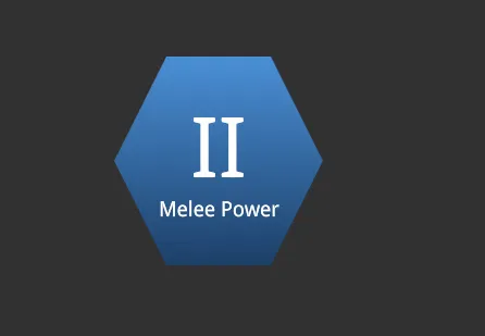
Slanted Health Bars
Section titled “Slanted Health Bars”For HUD bars, clip-path is often enough to create a more authored look without adding a new image asset. The structure can be a track with a fill
inside it:
import Block from '@components/Layout/Block/Block';
const SlantedStatusBar = (props: { percent: number }) => ( <Block class="status-bar"> <Block class="status-bar__fill" style={{ width: `${props.percent}%` }} /> </Block>);<div class="status-bar" aria-label="Hull integrity"> <div class="status-bar__fill" style="width: 68%;"></div></div>Both the track and the fill use the same polygon. This keeps the slanted right edge aligned as the fill changes width:
.status-bar {    width: 420px;    height: 28px;    padding: 3px;    background: rgba(255, 255, 255, 0.12);    clip-path: polygon(0 0, 100% 0, 94% 100%, 0 100%);}
.status-bar__fill {    height: 100%;    background: linear-gradient(90deg, #4fd6ff 0%, #1a6fff 100%);    clip-path: polygon(0 0, 100% 0, 94% 100%, 0 100%);}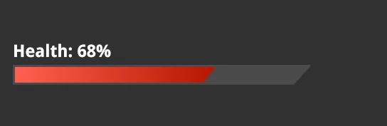
Composing Complex Shapes: Radial Menu
Section titled “Composing Complex Shapes: Radial Menu”Simple polygons and circles are enough for individual elements, but clip-path becomes especially powerful when you combine it with CSS transforms to
compose larger, non-trivial shapes out of simpler pieces.
A good example is the Gameface UI Radial Menu component. The menu is a full circle divided into even pie-slice segments. Each segment is a separate element that the player can hover or select independently. Building this with a single complex polygon would be fragile and difficult to maintain. Instead, the component uses a combination of clipped circles and rotations .
The idea is straightforward: every segment starts as a full circle, clipped to a wedge shape using clip-path, and then rotated into its position
around the center. The result is a seamless radial layout where each segment is still an independent, interactive element.
Use the slider below to compare the radial menu with and without clip-path applied.
Slide to see how the overlapping circles (unstyled) become seamlessly clipped and rotated wedge segments (styled):
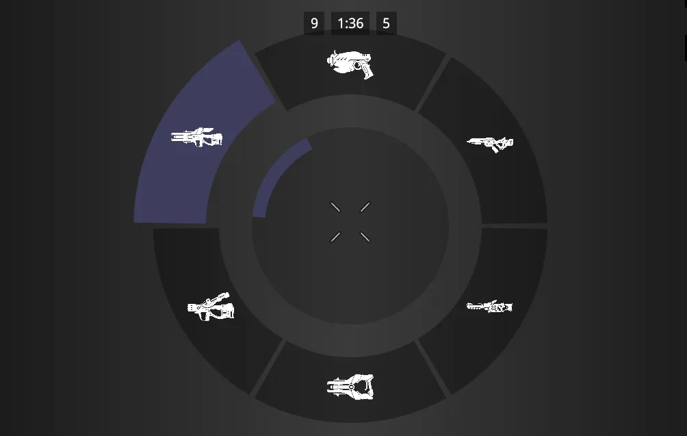
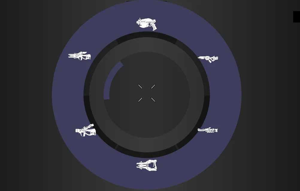
The technique follows a repeatable pattern. Each segment is a circular element clipped to a pie slice via polygon(), then rotated by an increment
based on the total number of segments. For a six-segment wheel, each slice spans 60 degrees:
.radial-segment {    position: absolute;    width: 100%;    height: 100%;    border-radius: 50%;    clip-path: polygon(50% 50%, 50% 0%, 100% 0%);}
.radial-segment:nth-child(2) { transform: rotate(60deg);}.radial-segment:nth-child(3) { transform: rotate(120deg);}.radial-segment:nth-child(4) { transform: rotate(180deg);}.radial-segment:nth-child(5) { transform: rotate(240deg);}.radial-segment:nth-child(6) { transform: rotate(300deg);}Caveats and Practical Guidelines
Section titled “Caveats and Practical Guidelines”clip-path is a strong choice for clean geometric silhouettes. It is straightforward to scale because the polygon points can use percentages, and it
works on any element type. There are a few things to keep in mind when working with it:
- The cut is always hard.
clip-pathcreates a binary visible/invisible boundary. It does not feather, blur, erode, or support partial transparency. If the art direction needs soft edges, smoke-like fades, or painterly alpha detail, usemask-imageinstead. - Borders and box-shadows are clipped too. The clip applies to the entire element rendering, including its borders and shadows. If the design requires a visible border that follows the clipped shape, you typically need a wrapper element or a layered approach where the border lives on a slightly larger element behind the clipped one.
- Hit areas remain rectangular. The element’s pointer-hit area is still its full rectangular box unless you also apply a matching shape on the interaction side. In most game UI engines this is not an issue because interaction areas are handled separately, but it is worth verifying click and hover behavior on clipped elements during development.
- Animate with matching point counts. CSS transitions and animations work between two
clip-pathvalues as long as both shapes use the same function type and the same number of points. This is useful for reveal effects, expanding shapes, or transitioning between states.
Soft Blending with mask-image
Section titled “Soft Blending with mask-image”mask-image works like a stencil. You provide a grayscale image (or a CSS gradient), and the renderer uses its alpha channel to dictate what stays
visible. White areas in the mask show the element (100% opacity), black areas hide it (0% opacity), and gray areas partially fade it.
Unlike clip-path, which only cuts a binary, hard edge, mask-image can produce soft fades, highly detailed silhouettes, and patterned reveals. This
makes it the right tool for:
- Minimap edges that fade smoothly into the HUD background.
- Character portraits that dissolve into a panel frame.
- Worn or battle-damaged overlays applied through grunge textures.
The mask never shows up on screen itself - it only controls which parts of the element are visible and how much. The actual visuals come from the element’s own background, children, or content. This separation means the same element can look completely different just by swapping the mask.
Shaping UI with Image Masks
Section titled “Shaping UI with Image Masks”The most direct use of mask-image is pointing it at a PNG or SVG asset. This is perfect for when you need a silhouette that is too organic or
detailed for a polygon, such as a faction emblem or a shaped portrait frame.
Let’s build a faction emblem step-by-step to see how this works in practice. Our goal is to create a complex crest shape filled with a rich, metallic texture.
Step 1: Create the Material (Without the Mask)
Section titled “Step 1: Create the Material (Without the Mask)”First, we define our structure: a wrapper element, and a child element that provides the visible pattern.
import MaskImage from '@components/Media/MaskImage/MaskImage';
const FactionEmblem = () => ( <MaskImage src="/assets/ui/faction-crest.png" fill class="faction-emblem" > <div class="faction-emblem__fill" /> </MaskImage>);<div class="faction-emblem"> <div class="faction-emblem__fill"></div></div>We will give the inner .faction-emblem__fill a metallic look by stacking a texture image over a gold gradient.
.faction-emblem {    width: 256px;    height: 256px;}
.faction-emblem__fill {    width: 100%;    height: 100%;    /* Stack a scratchy texture over a gold gradient */    background-image: url("./iron-grip.png"), linear-gradient(135deg, #c9a84c 0%, #7a5e1e 70%);}
At this point, if you load the UI, you will just see a hard, rectangular 256x256 square filled with gold and iron textures. It has the right material, but the wrong shape.
Step 2: Apply the Stencil (With Mask)
Section titled “Step 2: Apply the Stencil (With Mask)”To carve this square into an emblem, we apply the mask-image to the wrapper element. We will point it to an alpha-transparent image of a crest.
.faction-emblem {    width: 256px;    height: 256px;
    /* 1. Define the stencil shape */    mask-image: url("./crest-mask.png");
    /* 2. Control how the stencil is applied */    mask-repeat: no-repeat;    mask-size: 100%;    mask-position: center;}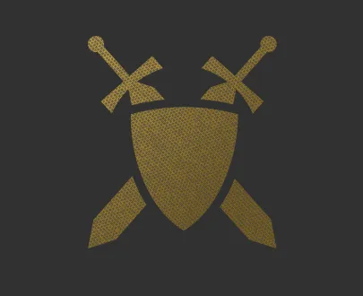
What just happened? The engine takes the crest-mask.png and overlays it on the 256x256 box. Wherever the mask image is fully opaque, the gold
texture inside .faction-emblem__fill shines through. Wherever the mask is fully transparent, the renderer clips the gold texture away entirely.
Feathering with a Gradient Mask
Section titled “Feathering with a Gradient Mask”You do not always need to load an external image asset. CSS gradients work perfectly as mask sources, which is incredibly useful for soft edges that do not depend on authored art.
A minimap, for instance, can be feathered with a radial gradient that is fully visible at the center and fades out toward the edges:
import MaskImage from '@components/Media/MaskImage/MaskImage';
const MinimapFade = () => (    <MaskImage class="minimap-container" fill>        <div class="minimap" />    </MaskImage>);
With CSS:
.minimap-container { /* Radial gradient mask stays in CSS as MaskImage renders a div */ mask-image: radial-gradient(circle, black 60%, transparent 100%); mask-size: 100%;}<div class="minimap-container"> <div class="minimap"></div></div>.minimap-container { width: 400px; height: 400px; /* Opaque center, then a controlled fade toward the edges. */ mask-image: radial-gradient(circle at center, black 0%, black 55%, transparent 80%);}
.minimap { width: 100%; height: 100%; border-radius: 50%; background: url("./minimap.jpg") no-repeat center center; background-size: cover;}Breaking down the gradient math: The engine generates this mask on the fly. From 0% to 55% from the center, the mask is solid black, meaning
the minimap is fully opaque and visible. From 55% to 80%, the mask transitions from black to transparent. This creates a beautifully calculated
25% “blur” zone where the minimap slowly fades into the HUD.
Caveats and Practical Guidelines
Section titled “Caveats and Practical Guidelines”mask-image is the right tool when the shape needs soft edges, detailed silhouettes, or gradual fades that clip-path cannot produce. Keep these
rules in mind:
- The mask needs material to reveal: If the masked element has no background, content, or children that produce visible pixels, the mask has nothing to show and the result is an empty space. Always verify your content renders before debugging a broken mask.
- Match the tool to the edge: Use image masks for highly detailed silhouettes where the art team needs pixel-perfect control. Use CSS gradients for simple, geometric fades (like vignettes) to save on asset loading.
- Watch your compositing costs: Each masked element requires the renderer to composite the mask against the element content. A few masked HUD elements are perfectly fine, but stacking dozens of full-screen masks can add measurable GPU rendering overhead.
Choosing the Right Technique
Section titled “Choosing the Right Technique”Use the shape technique that matches the visual problem:
- Use 9-slice scaling when the UI is still rectangular, but the frame artwork must resize without distorting its corners. Tooltips, dialogue boxes, modal frames, and item cards are common fits.
- Use clip-path when the shape has a hard geometric silhouette. Hex nodes, slanted bars, diamond markers, and angled sci-fi panels are good examples.
- Use mask-image when the shape needs soft edges, gradual fades, or detailed silhouettes. Feathered portraits, soft minimap edges, worn emblems, and patterned shapes are better handled as masks.
These techniques can also be combined. A tooltip can use border-image for its ornate frame, a clipped header for an angled title plate, and a masked
portrait inside the content area. The important part is to keep each technique responsible for one visual job.
© 2026 Coherent Labs. All rights reserved.