

Prototyping and Developing (Gameface UI)
Gameface UI is an official boilerplate powered by Vite and SolidJS , pre-configured with a comprehensive library of game-ready components.
This guide covers how to install the boilerplate, preview the pre-built UI views, understand the project structure, and create your first custom view using the component library.
Getting Started
Section titled “Getting Started”If you followed Option A in the previous “Setting up the Gameface Stack” article, you likely already have this installed and can skip to the next section!
If you are starting fresh, you can scaffold a clean copy with create-gameface-app . Open your terminal and run:
npm create gameface-app -- --template gameface-ui --defaultThe CLI asks for a project name, downloads the template, and installs the dependencies, leaving you with a project that is ready to run. Drop the arguments if you would rather pick the template from the interactive wizard.
Previewing the Pre-built Menu
Section titled “Previewing the Pre-built Menu”The boilerplate comes with a fully functioning menu view right out of the box so you can immediately see Gameface UI in action.
-
Start the Dev Server: In your terminal, type the following command to start the Vite development server:
Terminal window npm run devYour server is now running at
http://localhost:3000/menu, andhttp://localhost:3000lists every view in the project. -
Run the server in the player: Locate the
Player.batfile included in your Gameface package. Open the file in a text editor, scroll down until you see a similar command:Terminal window start "Player" /d "%wd%" "..\Player\Player.exe" --playerand add the following parameter to the end of the line:
Terminal window start "Player" /d "%wd%" "..PlayerPlayer.exe" --player "--url=http://localhost:3000/menu" -
“Launch the Player:” Launch the
Player.batfile and you should see a fully interactive menu screen rendered perfectly inside the game engine!
Understanding the project structure
Section titled “Understanding the project structure”To understand how that menu was built, we need to look at the project’s folder structure. Gameface UI enforces a specific architecture to keep your project modular and easy to navigate.
-
/src/assets: This directory is designated for all UI assets used in the development process. This folder can include files such as.png,.svg, fonts, and other resources. -
/src/components: All of our pre-made components live here!. This folder is organized into subfolders based on component types. Each component is a standalone block of UI that can be easily imported and reused across different views.-
Basic: Includes components like buttons, checkboxes, and sliders.
-
Complex: Contains more intricate components that combine multiple basic components, such as: color picker, carousel, radial menu and others.
-
Feedback: Here are the components that provide feedback to the users: modal, progress bars, toast and others.
-
Layout: Contains components for structuring your UI, such as grids, columns, rows and other structural containers that help with quick prototyping.
-
Media: Houses components for displaying images, icons and other media types.
-
Utility: Includes helper components that don’t fit into the other categories but are still essential for building your UI, such as:
Navigation. Which is our component for establishing a keyboard and gamepad navigation and interactions.
-
-
/src/custom-components: This directory is reserved for components created during UI development. We recommend placing all of your custom components in this folder. -
/src/views: Each view is a folder holding a component named after it, plus whatever else that view needs. The HTML document and the code that renders the component into it are generated for you, in development and in the production build alike. -
/tests: This is the place where you can write your end to end tests for your views. -
package.json: Handles project dependencies and defines scripts for running various commands. (You don’t need to worry about it yet). -
tsconfig.json: Specifies TypeScript rules and settings for the project (You don’t need to worry about it yet). -
vite.config.mts: Configures the Vite build tool, setting options and plugins to optimize and transform the source code for Gameface during the build process.
Structure overview
Section titled “Structure overview”Directorysrc
Directoryassets
Directoryicons/
- …
Directorycomponents
DirectoryBasic/
- …
DirectoryComplex/
- …
DirectoryFeedback/
- …
DirectoryLayout/
- …
DirectoryMedia/
- …
DirectoryUtility/
- …
- …
Directorycustom-components/
- …
Directoryviews
- global.scss styles applied to every view
Directoryhud
- Hud.tsx
- Hud.module.scss
Directorymenu
- global.scss
- Menu.tsx
- Menu.module.scss
Directorytests/
- …
- package.json
- tsconfig.json
- vite.config.mts
Creating Your First View
Section titled “Creating Your First View”Let’s put this structure into practice by creating a brand new “Inventory” view and dropping in a pre-built component.
-
Create the View Folder
Section titled “Create the View Folder”Inside
/src/views, create a new folder calledinventory. -
Create the View Component
Section titled “Create the View Component”Add a single file to that folder, named after it:
Inventory.tsx. It default exports the component that becomes the page.src/views/inventory/Inventory.tsx const Inventory = () => {return <div style={{width: '10rem', height: '10rem', 'background-color': 'orangered'}}>Inventory</div>;};export default Inventory;No HTML file and no
rendercall are required. The boilerplate generates both from the folder and the component it finds inside it.Anything else the view needs, such as additional components, helpers and assets, lives in the same folder alongside the component.
-
Test the View
Section titled “Test the View”Make sure your dev server is running (
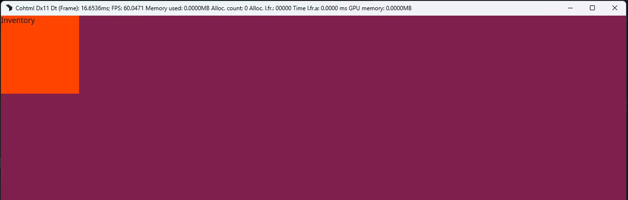
npm run dev), then open your Gameface Player and point it at your new view:Terminal window start "Player" /d "%wd%" "..PlayerPlayer.exe" --player "--url=http://localhost:3000/inventory"You should see a bright orange square with the word “Inventory” rendered in the Player!
-
Drop in some components
Section titled “Drop in some components”Now let’s populate the empty view with some real components from the library. Open
Inventory.tsxand import some of our pre-built components. We will use theToggleButton,CheckboxandSliderbasic components and theFlexlayout component to quickly structure them in a column with gaps.src/views/inventory/Inventory.tsx import Checkbox from "@components/Basic/Checkbox/Checkbox";import Slider from "@components/Basic/Slider/Slider";import ToggleButton from "@components/Basic/ToggleButton/ToggleButton";import Flex from "@components/Layout/Flex/Flex";const Inventory = () => {return <div style={{width: '50rem', height: '10rem', 'background-color': 'orangered'}}><Flex gap="1rem" direction="column"><ToggleButton><ToggleButton.LabelLeft>Off</ToggleButton.LabelLeft><ToggleButton.LabelRight>On</ToggleButton.LabelRight></ToggleButton><Checkbox value="fullscreen" >Fullscreen Mode</Checkbox><Checkbox value="motion blur" checked>Motion Blur</Checkbox><Slider min={0} max={100} value={35} step={1} /></Flex></div>;};export default Inventory;Save the file and check the Player again. You should see the components preview in the Player!
-
Style it
Section titled “Style it”Most of a view’s styling belongs in
Inventory.module.scss, next to the component. The.modulepart is what scopes those rules to this component through CSS modules, so a class named.panelhere cannot collide with a.panelin another view.src/views/inventory/Inventory.module.scss .inventory {padding: 2rem;}src/views/inventory/Inventory.tsx import styles from './Inventory.module.scss';const Inventory = () => {return <div class={styles.inventory}>...</div>;};export default Inventory;Rules that cannot be scoped,
htmlandbody,@font-face, bare element selectors, go in aglobal.scssinstead. There are two of them, both optional:src/views/global.scssapplies to every view. The boilerplate uses it for the root font size and to make the body fill the viewport, so those rules do not need repeating per view.src/views/inventory/global.scssapplies to this view only, and loads after the shared one so it can override it.
Both load before the view’s module styles.
Gameface UI features
Section titled “Gameface UI features”The Gameface UI project comes pre-configured with a lot of features to make your development experience as smooth as possible. Here are just a few of them:
Hot Module Replacement (HMR)
Section titled “Hot Module Replacement (HMR)”Every time you save a file, the Player will instantly update with your changes without needing a manual refresh. This allows for a super fast development iteration cycle, where you can see the impact of your code changes in real-time.
Alias imports
Section titled “Alias imports”To make your imports cleaner and more intuitive, Gameface UI comes with pre-configured alias imports for the most commonly used folders. You can import components, assets, and custom components using simple aliases instead of long relative paths.
| Folder | Alias |
|---|---|
/src/assets/ | @assets |
/src/components/ | @components |
/src/custom-components/ | @custom-components |
/src/recipes/ | @recipes |
Consider the following folder structure:
Directorysrc
Directoryassets
- logo.png
Directorycomponents
DirectoryLayout
DirectoryBlock
- Block.tsx
- …
Directorycustom-components
DirectoryMyComponent
- MyComponent.tsx
Directoryviews
Directoryhud
- Hud.tsx
- …
- …
To import logo.png, Block.tsx, and MyComponent.tsx in Hud.tsx, you can write:
import Block from '@components/Layout/Block/Block';import MyComponent from '@custom-components/MyComponent/MyComponent';import Logo from '@assets/logo.png';
const Hud = () => { return ( <Block> <img src={Logo} /> <MyComponent /> </Block> );};Deep tools integration
Section titled “Deep tools integration”Because Gameface UI is built on top of Vite and SolidJS, you can take advantage of the rich ecosystem of tools and plugins available for these technologies.
We have also integrated some of our own tools and libraries directly into the boilerplate:
- The Gameface E2E testing library, which allows you to write end-to-end tests for your views using a simple and intuitive API.
- The Interaction Manager library , which provides a powerful system for handling user navigation and input in your UI.
- The Vite Gameface style transformer , a Vite plugin that transforms your inline styles to reusable CSS classes at build time to ensure optimal performance in Gameface.
© 2026 Coherent Labs. All rights reserved.